Unlike the click-through landing pages that serve as the “warm-up” platform before an action like selling products or services, the so-called lead generation landing pages are mostly used for collecting personal information and to establish contact points in order to create as many “prospects” or labels for the business as possible.
In practice, this maximizes the interactions between your page and the visitors to establish contact.
To do this, your landing page’s main objective would be to collect personal information including:
- The first name and last name
- The telephone number
- The email address
For activities like consulting, SaaS (Software as a service), education or financial solutions, or other businesses dealing with similar activities, the leads are crucial. The leads are directly proportional to sales.
Yet a lot of websites don’t pay attention to their ability to attract new leads continually.
If your business is one of them, no need to panic. This article will prove helpful in making you understand:
- Why one must create a landing page for generating leads?
- Where you should improve to stand out from the competitors?
- How can you attract prospects even without using Google Ads?
In case you are interested in learning about how you can generate more leads using Google Ads, you can read this article as it will give you the detailed information.
10 tips to help you generate leads on your landing page
1 Always pay attention to the design
Rough designs never inspire confidence.
If you wish to generate leads, you will need to start from the scratch i.e. from the design of the landing page.
Also, you will need to make sure that the design is clear and easily understandable for everyone.
To create an impactful design:
- Differentiate the “titles” of the paragraphs
- Harmonize the theme’s colors
- Play on symmetry and shapes
Remember to let the text breathe such that it becomes easier to read.
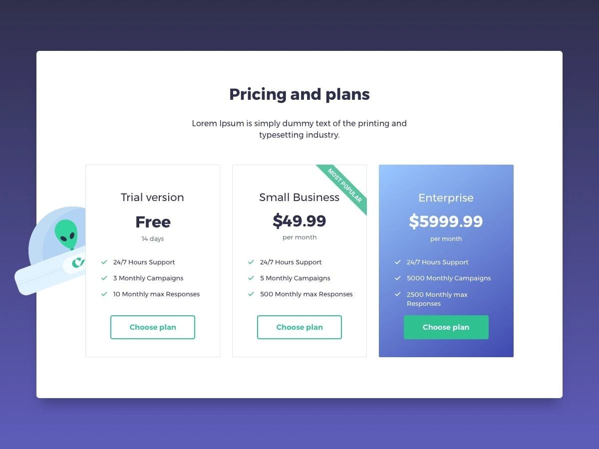
In case you are presenting distinct offers, try to highlight one in relation to others. Focus the leads on particular offers.
In the above example, the landing page is designed in a way to highlight the intermediary offer. Your website should always use the “most popular” tag for the offer that you want to highlight.
However, the landing page should remain clear and fairly easy to navigate.
2 Work on the call to action
An impressive “call to action” is an important factor when you’re working on the landing page.
In fact, it is an element of the landing page that aims to trigger an action.
A lot of different actions are possible including:
- Registration form (personal details)
- Subscribe to the newsletter (email)
- Buying a product/service
- Free trial (personal and bank details)
- Asking for a callback/contact
- Reserving a service
A call to action should be viewed as the culmination of your business proposal. The call to action must be introduced by the sales pitches and should be highlighted in relation to the rest of the page. You can gather more information about the importance of the call to action.
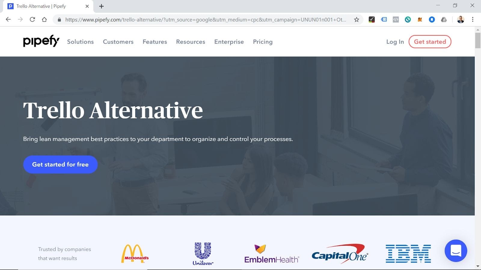
On the website of Pipefy, the landing page is designed in a way so that it can look simple yet be impactful.
There is a precise and well-written paragraph containing the value proportion.
The blue color button in the center highlights the call to action. That blue color button also resonates with the “Get Started” button that is located in the upper right corner.
For the CTA, you can observe two elements:
- The presence of the argument “for free”
- Making use of “Get Started” as an imperative
The usage of imperative often pops up when you’re writing a call to action. This method involves the visitor in a process by speaking to them directly. It should be a direct and personal approach than the traditional “Registration”.
3 Looking after the forms
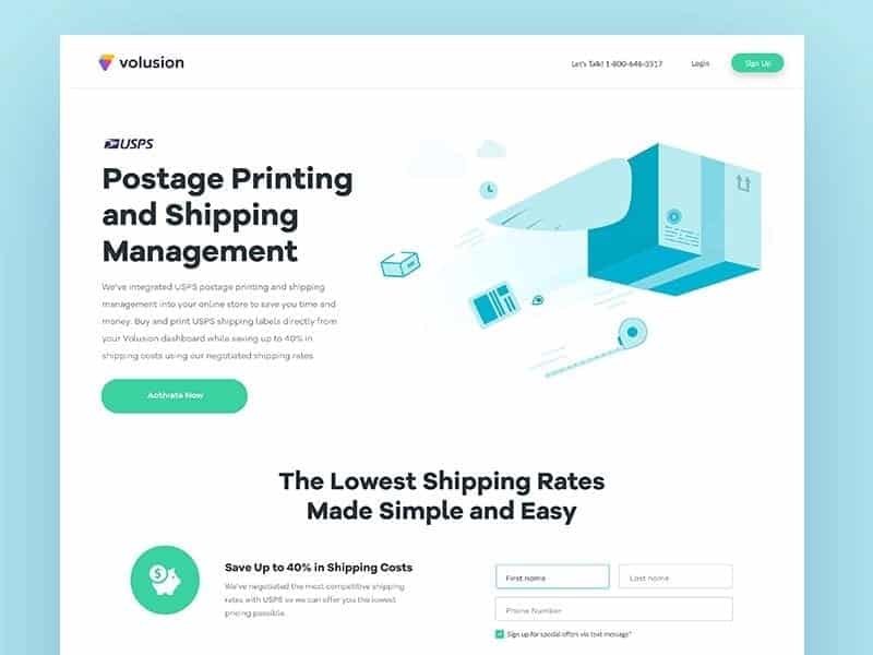
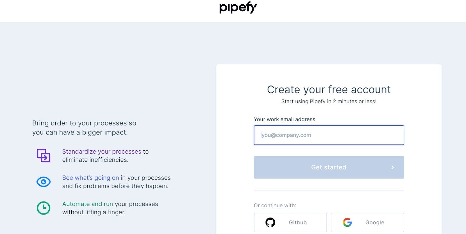
When you’re considering landing pages for lead generation, the form should be the final step. The quality of the forms will determine if the visitors will be happy with parting with their personal information or not.
The instructions to create a form that converts are similar to those used to create a good call to action.
- Make the form look unique and different from the rest of the page
- Try to use attractive colors
- Provide an interesting and clear value proposition
Here are some general tips that will help you create forms that convert:
- Ask for the minimum
Minimize the forms. Why do you need to ask for too much information from the visitors? It will be useless and counterproductive. This will surely make them run away. A good form is one where you only ask information that is needed for the remaining portion of the process. The first and last name, an email address, and phone numbers are the most you should be asking.
- Make use of buttons and checkboxes
Visitors aren’t particularly fond of writing. For maximizing the lead generation, you can try to replace fields with quizzes, checkboxes, and multiple selections. This method will allow you to choose the answers and check beforehand hence resulting in better quality leads. It will eve increase the lead count.
- Focusing on the benefits
Similar to CTA, you should highlight the benefits of signing up or for giving the personal information. Without showing a relevant value preposition, the visitors will never want to part with their personal data. For increasing the number of leads, never hesitate in offering a real counterpart. It could be in the form of an e-book, a free trial, or a newsletter.
- Optimize for mobile devices
While the proportion will vary by industry, the majority of the websites see half or more than half of their traffic arriving from smartphones or other mobile devices.
If you are creating a form, be sure that it needs to be responsive and it keeps an optimal mobile view.
For better results, you can create forms that are specifically designed for mobile devices. This way, you will be sure that your visitors will have an optimal user experience.
- A/B test your forms
While implementing changes for improving your forms can be a good thing but tinkering too much with the forms can sometimes hinder the website. Implementing changes proves that you’re aware of the fact that forms are important for your lead generation landing page. But how will you quantify the performance improvement?
For this dilemma, it is recommended that you perform A/B testing on the forms. In short, an A/B test will allow you to compare two distinct versions of the same landing page.
4 Adding testimonials from real customers
Customer testimonials function as social proof. The more testimonials you post, the more you are reassuring the potential visitors of the page.
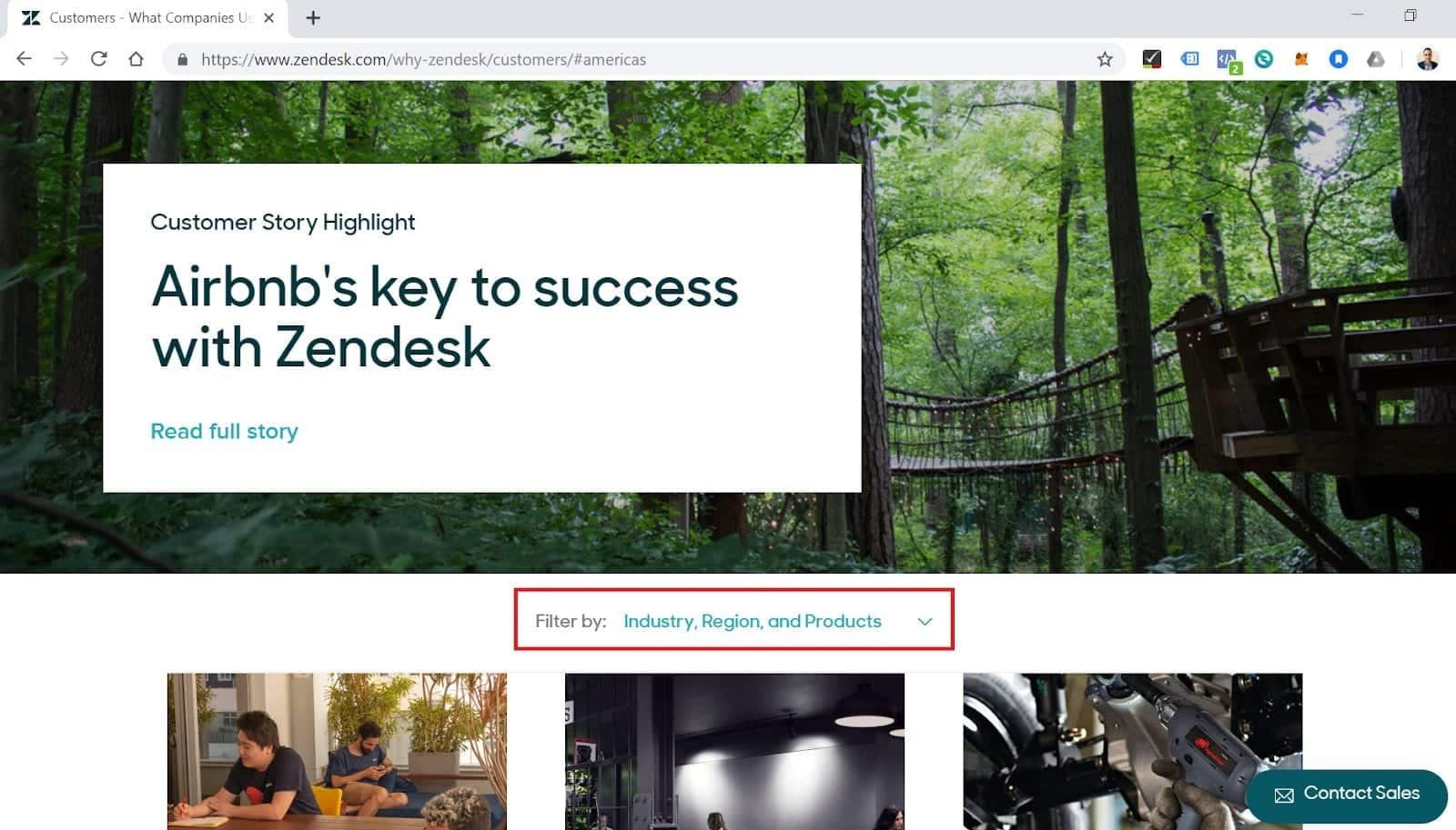
In the Zendesk site, their team created a webpage that was dedicated to its customers. Their testimonial page was beautifully laid out, with a menu for filtering testimonials by company size, location, industry, and use case. There were even thumbnails that linked to the full customer stories from a variety of big-name brands.
5 Highlight the benefits that you offer
A lot of the websites create landing pages that explaining “What they do” but they tend to forget to talk about “how it will affect the customers positively”.
When a visitor comes across your landing page, they will want to see what they are getting and what benefits you are offering.
For generating more leads, you should focus on highlighting the benefits and strengths of the services.
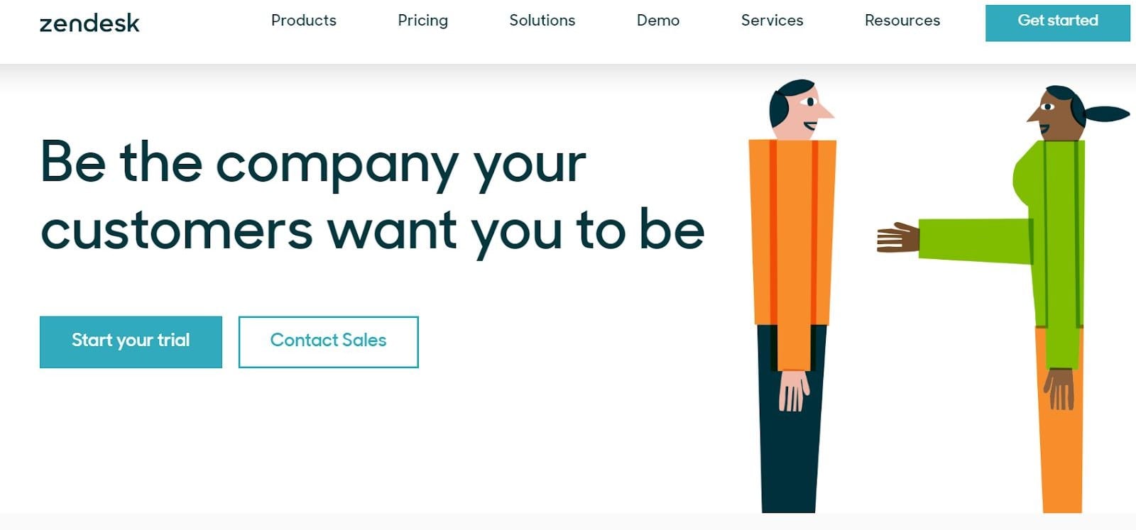
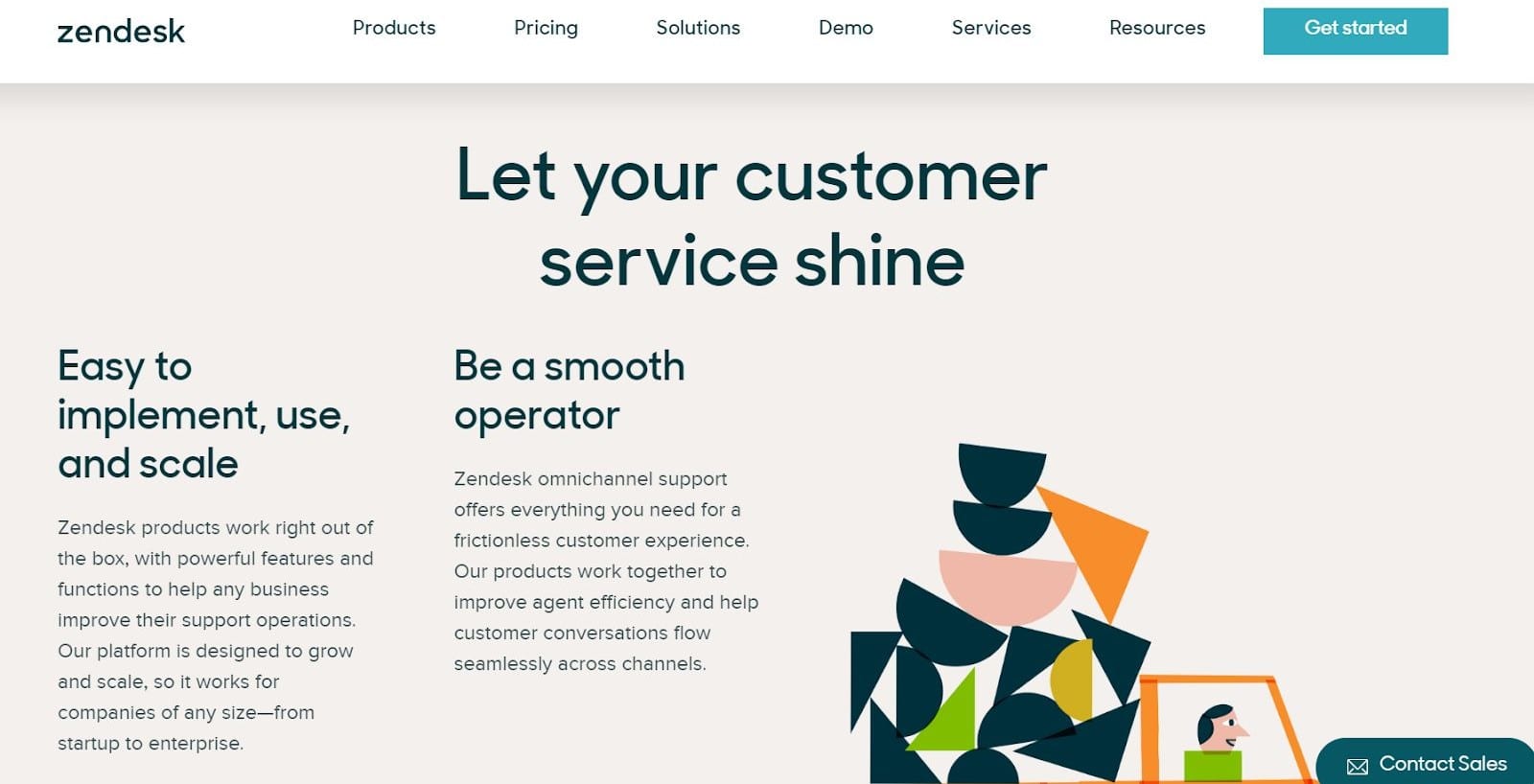
In the Zendesk website, you can notice how they have presented the features as sales pitches and benefits “Be as your customers want you to be”, “Make your customer service shine”.
This way, you can formulate your offer and explain to the visitors how your offer will make their life easier and what will change for them.
6 Providing limited offers
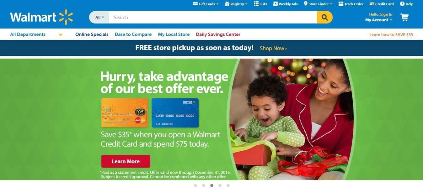
Time is money. For increasing your conversions with ease, there is a trick that you can use. Create offers that are limited in time and quantity, and you will notice more people showing interest.
The purpose of this limited offer trick would be to create a deadline to take advantage of this tempting offer. You will get your visitors to make decisions at a quicker pace once they discover your services.
7 Paying close attention to the conversion funnel
The conversion funnel is a representation of all the preliminary steps to the visitor’s action. Therefore, it will include the whole process for makes the visitor a lead or a customer.
The general idea would be to create a conversion funnel right from the acquisition channel to the landing pages.
Here are a few examples of simple conversion tunnels:
- Google Ads campaigns target keywords that point out to landing pages that are optimized for those same keywords.
- Free e-books exchanged for an e-mail address that contains a link that points to one or more landing pages that are created specifically for the theme of your e-book.
- Facebook Ads that target specific segments that are directed to your landing page optimized specially for this segment of customers.
When you’re working on the shopping funnel, pay close attention to the consistency between the acquisition channels and your landing pages.
For maximizing conversions, it is recommended that your marketing message should be the same in every stage of the conversion funnel.
8 Create relevant resources that are tailored to your target audience
There are some good landing pages and some not-so-good landing pages. The ones that stand out are the ones that provide the customers with high-quality content that is adapted for the target audience.
The goal is to create an interesting and easy-to-understand resource that will provide relevant information. It should also present your services to the customers and reinforce your authority in that area.
There are endless creative possibilities and they vary depending on your activity. However, there will be some recurring supports like:
- Videos
- Guides
- Infographics
- Articles
- E-books
9 Be Bold: Try to create a page for each type of customer
If there is one particular mistake that you shouldn’t make when you’re trying to generate leads is to believe that all the segments of visitors are the same and they need to be treated the same. The key to standing out would be to personalize the user experience.
The first step to creating separate landing pages that are based on the customer segments would be to understand which segments of visitors are viewing your website.
For this, you need to go to Google Analytics in the Demographics tab in the Audience section. You will be able to obtain detailed information on the number of sessions categorized by sex, age, geographical origin, etc.
10 Do A/B testing to improve the conversion rate
A/B testing will allow you to quantify the page’s performance by comparing two different versions of the same page.
- Page “A” referred to as the “control”
- Page “B” referred to as the “variant” whose performance you are looking to measure
Specifically, you currently have the landing page A. You are looking to change the form in order to increase the leads. You should make use of the A/B testing tool and create a variant of the landing page which will contain the new form. Some of the traffic will be directed to page A while the remaining will revert to page B. After some weeks, you will get the results. Page B with the newer form would have brought you more leads.
Bonus Tip: Understand the way your users behave
If despite using these tactics, your landing page doesn’t convert more, there is a change that you would have reached a ceiling. In order to reach a breakthrough, you will need to use newer methods. These methods will help you in understanding the obstacles that are preventing your visitors from converting.
You can even make use of tools like session recording and heat maps as they will help you visualize the way people interact with your pages.
These tools are exceptional for helping you to continually optimize the conversions and making the landing pages a true lead generation machine. If you are looking for more information, get in touch with us!
